Time Winder

Soon after the Iphone had come out and Android had some initial phones on the market I was working at a Verizon R&D lab and had some time to think about time. Actually, I was asked to work up ideas for these new touch phone interfaces. As I was currently winding down UX work on a scheduling app I used time management as starting point for what I called the Time Winder.
The novel part being in the way interface displayed the time of day and how a user interacted with their schedule in an intuitive and fun way while still staying somewhat useful.

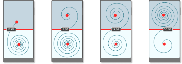
A days "timeline" is represented by a winding line where the start of the day is the red dot on the top half of the screen, the end of day, the bottom red dot. Connecting the beginning and end is a winding timeline. Through the middle of the screen is the 'time horizon' with a draggable 'event marker' that shows the time where the timeline hits. Dragging the marker from left to right on the time horizon curls or uncurls the timeline.

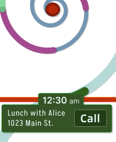
A users appointments would be marked along the timeline so when the user scrubs the event marker through the days timeline and an appointment hits the time horizon line details of the appointment would be revealed on screen where the user could choose to act on it.
Verizon patented the idea and I got to start early prototype development on it but priorities changed and the time was not right for the Timewinder. I really liked working on this and would love to do more work on time interfaces in general, now the problems finding the time.
Below is a link to the PDF and Google Patents page about it if you're interested.